Hello 👋, I'm Akash from India, working as a frontend developer at Classcard. Also, Happy New Year! 🎉
Classcard is a lightweight student and class management system. It is the fastest way to organize and sell classes online. More info at the end of the article.
CSS can sometimes be daunting, especially if you are a junior dev or new to the web dev world, but it has some pretty neat tricks up its sleeves. If we can utilize them, we can create awesome stuff without writing too much code. Today I am going to share with you one such trick that I always fall back onto whenever I have to create a responsive image gallery. I decided to take a practical approach to this guide, so please follow along so you can get hands-on practice. I recommend using codepen so you don't have to worry about setting up a dev environment, to get started, go here -- https://codepen.io/pen/.
HTML
<div class="gallery">
  <div><img src="https://source.unsplash.com/random"></img></div>
  <div><img src="https://source.unsplash.com/random"></img></div>
  <div><img src="https://source.unsplash.com/random"></img></div>
  <div><img src="https://source.unsplash.com/random"></img></div>
  <div><img src="https://source.unsplash.com/random"></img></div>
  <div><img src="https://source.unsplash.com/random"></img></div>
  <div><img src="https://source.unsplash.com/random"></img></div>
  <div><img src="https://source.unsplash.com/random"></img></div>
  <div><img src="https://source.unsplash.com/random"></img></div>
  <div><img src="https://source.unsplash.com/random"></img></div>
  <div><img src="https://source.unsplash.com/random"></img></div>
  <div><img src="https://source.unsplash.com/random"></img></div>
</div>
Let us first write HTML required to make the image gallery, we will use div's to hold the images and will use a parent div with a class of gallery, which we will use in our CSS to style the gallery. As for the source of image's, we will use Unsplash API to get random images.
CSS
/* Gallery styles */
img {
  display: block;
  width: 100%;
  height: 100%;
  object-fit: cover;
}
.gallery {
  display: grid;
  gap: 1rem;
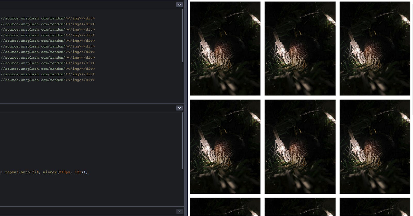
  grid-template-columns: repeat(auto-fit, minmax(240px, 1fr));
}
We will use img css selector to style images, I will explain what each line does, you can skip ahead if you already know. display: block; is used to make images block elements, which will help us avoid small gap below images, you can learn more about it in this video, thanks to Kevin. -- Get rid of that small space under your images. We also set the width and height of images to 100% so images can take up all the available space in div's. object-fit: cover; is used so that it will cut off the sides of the image, preserving the aspect ratio so we can avoid our images looking stretched or blurry. This is optional based on the type of content in your gallery.
We will use .gallery css selector to create our responsive image gallery, surprisingly it takes only 3 lines of CSS. display: grid; is used to declare that we want to use CSS Grid. gap: 1rem; is used to create both horizontal and vertical space between images so they look good. Rest of the magic lies in this line - grid-template-columns: repeat(auto-fit, minmax(240px, 1fr));, which helps us create the responsive grid.
Let's break down the line so it makes sense, first grid-template-columns: is a property that is used to define no of columns our grid should contain. repeat() is a CSS helper function that is used to repeat a property without having to write it multiple times manually. Similarly, minmax() is a css helper function that is used to define the width, with min and max values. In our code, we have defined it as min of 240px and it can go max up to 1fr. The value of 1fr depends on the no of columns in the grid, if there are 2 columns, the value of 1fr is 50%, if 5, 10% and so on. But how many columns does our grid have? Here is where it gets interesting, we can now combine both repeat() and minmax() and create this - repeat(auto-fit, minmax(240px, 1fr));. This tells our browser that, if there is enough space for a new image to fit into the column, while all the other images are at 240px and gaps are also considered, display that picture in the same column, if there isn't enough space, show the image in a new column, and the remaining space in the first column is equally divided to the images present in the first column since the unit of width falls onto 1fr in that case.
If you want to learn how this works in-depth, I highly recommend this resource, thanks to Jeff -- Build three different responsive CSS grid layouts from scratch.
Result
Thanks for sticking around until the end, if we do this, this is the final result --
Please share this article with your friends and co-workers if you think this can help them too. Thanks a lot for your time, we are planning to rewrite our web app to nuxt at Classcard, I will have a ton of content to write about and I am planning to write an article each week. If you'd be interested in that, please follow!
Now, as promised - Classcard helps organize class schedules, collect inquiries, mark attendance, grade assessments, share files, and relay personalized feedback. It also makes selling classes online easy with an instant ‘online booking page’. Class providers have had to transition to online classes or at least facilitate online booking for their (socially distant) classes. Classcard fits into the way educators already work - it integrates with video meeting platforms like Zoom. There’s also a student side app, where students are reminded of their classes. Students can also see teacher comments and track progress visually. If this sounds interesting to you, check us out at classcardapp.com
Ps. We also have a generous free plan and you can also book a demo with us at classcardapp.com/request-demo
